Font Styles
|
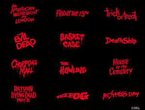
During the development of 'When The Moonlight Falls', we played with several versions of the title font in order to create a brand that was both immediately identifiable and that fit well with our poster. Of course, in the spirit of headlines like 'My Bloody Valentine', ''Friday the 13th' and 'A Nightmare on Elmstreet', our projected was given a statement rather than a base word as it's title. By having a longer, more identifiable name, it is our intention to make it much more memorable to the audience as well as to indicate a feeling of danger and inevitability by using the connotations of 'when' and 'falls'.
|
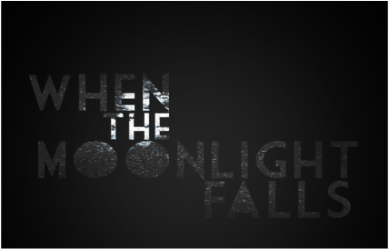
However, this rubric also needed to be visually and aesthetically appealing, adhering to both graphic design principles and branding demands as the title is spread to different formats (such as possible posters or DVD covers). To this end, we drafted several initial inspirations that we felt fit both the Horror genre and the specific mood of our theme with one of the stimulus' we kept returning to being 'night culture' and 'technology'. Early incarnations as seen here depicted an Art Deco font masked with an image of the moon at night with heavy static effects used in the spirit of that retro TV look. Although this proved to be a popular idea, when actually put on our poster, we realized that the sizing was to irregular and the style to complex for an already developed poster.
|
|
|
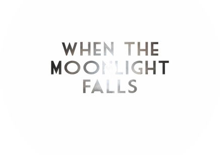
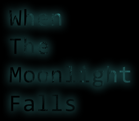
Similar attempts with a less distorted effect and a more centralized typography were certainly more visible against the poster but again broke the aesthetic we'd already created as well as sometimes struggling to be fully legible especially when pitched against a bright or shaded backdrop. The Art Deco font remained for several drafts as it is evocative of the languished excess of the 1950's and that culture of money and corruption. Again though, with the 80's horror flick being a better reference point, this idea fell away from the final choice.
|
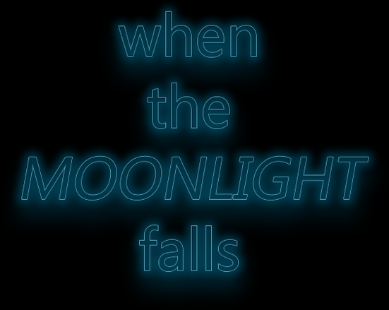
We still liked the hollowed font style up to this point and for a long time the version seen on the bottom left was set to be our font of choice, the neon style both creepily unsettling and in keeping with both the culture of the night and our technology designs. It wasn't until we tested the following 3 on our poster that we ran into issues of colour inconsistency with the predominant pallet of said poster being muted and saturated colours with an emphasis on the black and white dichotomy so throwing a glowing blue style into the mix created a lack of cohesion in our project. We also felt that this style was too close to the design of recent hit 'It Follows' to an extent nearing on plagiarism and as such, it was scrapped. This round of experiments did teach us however that the white font was the most cooperating with our existing designs; it's bold, it's simple and it's identifiable and moving forward, this would come back into play for a final designs.
|
|
|
|
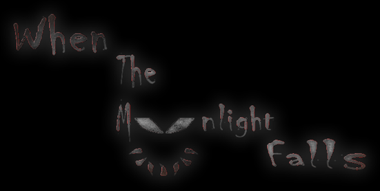
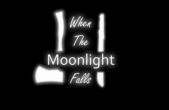
Before we'd come to settle on the cleanly cut white style, we did experiment with trying to incorporate our brand into the font using key items from our actual trailer like the masks and the weapons to weave between the fonts. The design on the right here is a particularly ill fated version of this concept styling itself with the scratching visuals of original horror classics (as seen at the top of the page). The white and grey look worked to an extent but the font as a whole just looked too tacky to be taken seriously.
|
|
|
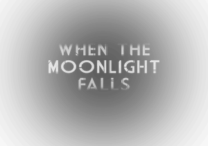
Both efforts on the left and right did go on to inspire the final font style but were themselves too far removed from the tone of the film to fit in. The ominsprescent glow did return but besides that, although amongst the upper echelons of our creation, these too were axed.
|
|
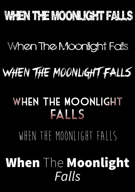
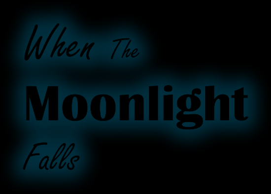
This shortlist represents the combined knowledge from researching developing our existing fonts into something that we genuinely argued about as being our final design. The strong, crisp white design came to feature strongly with the basic horizontal crawl of the text also becoming a staple of our project. In the end, it was the second version in this list that won over - as seen below in it's completed state - as we felt this met all of the principles we were trying to create with. The neon glow that swamps it still implies that late night neon feeling we'd set out with and by extension technology but at the same time is clean and easy to read, outside of that you've also got a damaged few letters among the list that carry through this idea of danger or menace whilst not going overboard. Finally, we all agreed that this fit best on our poster as it was both recognizable enough to be independent of the picture but subtle enough to not overcomplicate what was already set in place.
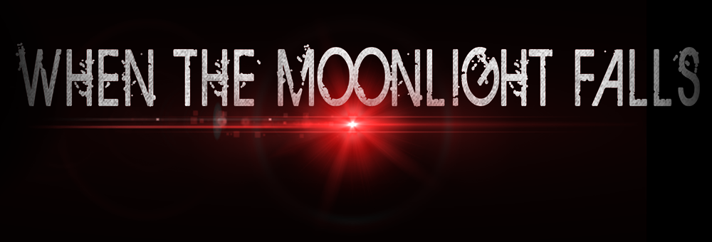
This is our final title as seen on the poster, the font style is still broken and implies violence with the text under heavy kerning effects that space the letters out enough at parts that they are identifiable. You will also notice the inclusion of an added red lens flare under the two O's in the title which was added late and off the cuff for both adding a violent and suggestive color as well as to look like the lens flare from camera record lights or webcams. In the spirit of our Hunters tracking the protagonist through the Deep Web, it felt only fitting to represent that through the titles. You'll also notice how the first and last words are darkened slightly whilst the central typography is fully lit white and by the lens flare, almost as if in a beam of moonlight. The finally thing to mention is how the text is textured very subtly with a grunge brush that give a lined fabric look to the white, like a dress or cloth; spoiled white is often used to represent to show the death of innocence, fragility and in some cases virginity which is why we went at the uniform white with black stains.
