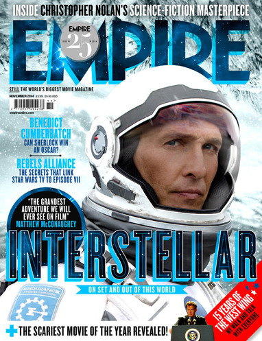
One of the most common elements to any film magazine cover is the large, edited and bold title usually placed within the scene itself; obscured partially by the actor or subject of the headline article. Take for example one of the most popular selling magazine's in the industry - Empire - who have such a sense of clout to the public that they can afford to partially hide their header beneath the far more advertising star. After all, a celebrity's face is far more marketable in this day a simple word. The puff line atop the title as well tends to be capitalized with a san serif font that reinforces the main selling article for the issue. The colour style does tend to be formatted specifically to match that article two with the example on the characterizing this with the sci-fi blue of Interstellar making it's mark on almost every piece of text from the strap line to the masthead.
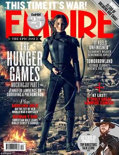
You'll also notice that the majority of the subject image (such as Jennifer Lawrence on the right) is given precedence over the rest of the content on the page, again, to reinforce what exactly is being sold and to draw the eye with centre framing (or the rule of thirds in the Interstellar edition). The more superficial content like the puff, the barcode, the issue data etc are written in a smaller typeface with their inclusion restricted as to not take away from the main headlines, leaving more space around the page to composite something that might actually intrigue a customer into buying it.
You'll also notice that the majority of the subject image (such as Jennifer Lawrence on the right) is given precedence over the rest of the content on the page, again, to reinforce what exactly is being sold and to draw the eye with centre framing (or the rule of thirds in the Interstellar edition). The more superficial content like the puff, the barcode, the issue data etc are written in a smaller typeface with their inclusion restricted as to not take away from the main headlines, leaving more space around the page to composite something that might actually intrigue a customer into buying it.
|
|
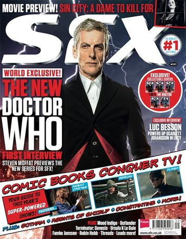
You'll also notice that popular magazines use cut away imagery and baiting titles like 'Comic Books Conquer TV' or the screen grabs from other projects to create a very dense page space; there is next to no 'breathing' room for the images as they are completely cut over with other headings capitalized for dramatic effect. You'll notice that although there is a lot of bright and bold complementary colours, the font styles are just as varied with the more classic comic book font on the Doctor Who issue of SFX in keeping with the articles it's detailing for consistency. It's also worth noting the use of slanted banner art to put colour behind the main image and actually break up the layout from the central picture although I can't say having such a departure from the the main colour scheme and house style is something I personally like.
|
|
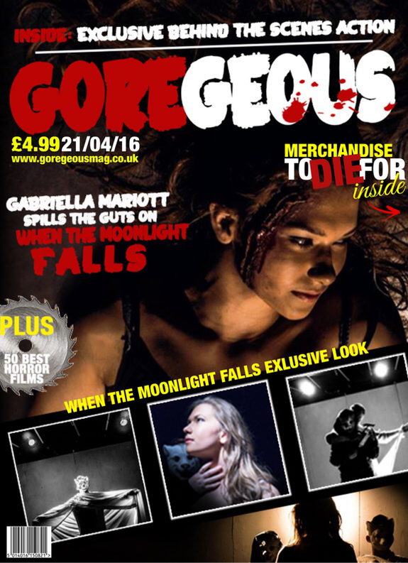
For our final magazine poster, although it had undergone a few recuts, we decided to create a new horror movie magazine named 'GORE-GEOUS' which utilized some of the techniques already seen in the popular contemporaries. For example, the main title is written in Block San Serif and is positioned behind our central actress so that is it is legible yet hidden.
We also decided to use a variety of tag lines and font styles that made the cover look more aesthetically complex and that encouraged the reader with eye catching slants like '5 things YOU missed' that personally addresses the potential customer. The white and red colour scheme was inspired from the Mockingjay edition of Empire and in general is just a real complimentary colour scheme especially when you consider that the background (which was edited into the base picture) has been made black and white so as to better highlight both the text and the subject. The bottom of the page also saw the return of the captioned cut away articles but instead of using a tacky new banner, we instead used basic white boxes that the characters overlapped, keeping up the theme set by having Gabriella overlap the masthead. Finally, we included the issue number and barcode along the bottom as it is tertiary information that doesn't sell issues and as such had to take up as little space as possible.
We also decided to use a variety of tag lines and font styles that made the cover look more aesthetically complex and that encouraged the reader with eye catching slants like '5 things YOU missed' that personally addresses the potential customer. The white and red colour scheme was inspired from the Mockingjay edition of Empire and in general is just a real complimentary colour scheme especially when you consider that the background (which was edited into the base picture) has been made black and white so as to better highlight both the text and the subject. The bottom of the page also saw the return of the captioned cut away articles but instead of using a tacky new banner, we instead used basic white boxes that the characters overlapped, keeping up the theme set by having Gabriella overlap the masthead. Finally, we included the issue number and barcode along the bottom as it is tertiary information that doesn't sell issues and as such had to take up as little space as possible.
|
|
Before settling on the final magazine title of 'Gorgeous', we considered the title 'Simply Dead' which is a play off well-known band Simply Red. We thought that using the word dead which emits horror connotations and adding the adverb Simply in front of it implies that this magazine is simply horror which would appeal to a horror-crazed audience.
