Movie: Sinister
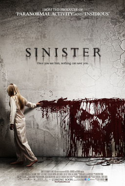
Sinister's poster revealing small things about the film and key ideas in it but in a very subtle way. The ink that the child is dragging forms the face of the antagonist Mr Boogy, is black, showing that the face must be evil and the colour of the black on the white is suggesting a loss of innocence/childhood. The child could be seen as the victim in this poster or the very opposite, since she is causing the face to appear on the wall. The child looks young, which could show that she is innocent but maybe that will change through the course of the film. The font used is a type of variation on the font Times New Roman, which is very commonly used in horror films. The white wall, contains cracks, which could suggest that her innocent is already being tainted by the evil being.
Movie: The Last Exorcism
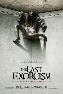
The Last Exorcism's poster shows a rather disturbing images of a girl that looking to be in her teens, in a very strange position that looks as if her arms and legs are broken and is somehow levitating in the corner of a room. The darkness is covering her face, suggesting to the viewer that she evil or possessed by something evil. The picture contains only 2 main colours, black and white, which could show that the innocence this girl had, is becoming tainted.
The font used is a type of variation on the Times New Roman font, with smudged markings on the letters, again suggesting something smudging and tainting innocence.
The font used is a type of variation on the Times New Roman font, with smudged markings on the letters, again suggesting something smudging and tainting innocence.
Movie: The Grudge
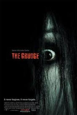
The Grudge's poster shows a disturbing images of an eye and half a face that is covered in hair. The majority of the picture is covered in black hair, the colour black could represent evil, darkness, and something unknown. The skin of the girl is very pale, suggesting that she could be sick or possibly not human, so there is a chance she could be the antagonist of the film. The font is in red, showing danger and blood due to red's colour connotations.
Movie: Orphan
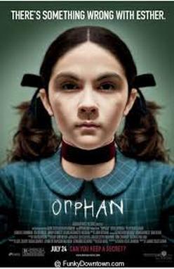
Orphan's poster shows a girl that looks to be in her teens, that looks as if she is creepily staring at you. In this poster, she seems rather innocent and looks normal, however the thing that makes it a horror poster is mainly the font, and the fact that her eyes are very dark, almost black. It looks as if she is possessed, due to her emotionless expression and her dark eyes, making it rather creepy to look at. The font looks like it is written in chalk, like it is almost scratched on, showing the view that there is definitely something wrong with the girl.
Movie: Saw
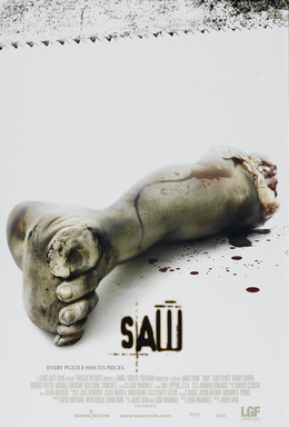
As a franchise, SAW has always revelled in the grotesqueness of its iconography; you'd be hard pressed to find an audience member that couldn't recount a gruesome personal anecdote about "that bit when the character sawed his leg off" or "that bit where the girl had the bear trap on". It is very fitting then that the poster depicts this, denouncing the traditional emphasis on a character or actor/actress for something more closely related to the brand. It is worth noting that, although perhaps a small detail, the dirty and cerated pattern across the top of the page also continues this theme of relating the imagery to assets from the film; it is quite literally a saw pattern. The use of a white backdrop also places an emphasis on just how rotten and dirty the central leg is, juxtaposing sterile whiteness against the disheveled limb and filthy weaponry respectively, once again mimicking the grimy tone of the movie. Even the iconic 'SAW' title font is imbued with this sick and broken aesthetic; its inconsistent case, size and letter-spacing also perpetuate the violence and horror that the franchise in notorious for.
Movie: It Follows
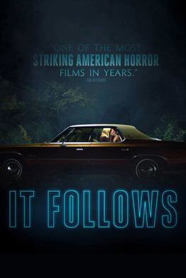
'IT FOLLOWS' strays away from the generic aspects of horror posters to instead focus on a dark, nostalgia drenched tone making it stand out from the legions of close up killer shots. Almost every aspect of this poster exudes a feeling of unfamiliarity despite it superficially being quite harmless. The top-lit, beige/orange styling of the car contrasts nicely with the synthetic blue of the main font and the thin lamp light fog that spools specifically, allowing the darkness the envelope the vehicle. By having this as a long shot of something inherently quite private, it implies to the viewer that the couple in the car are being watched in some way which is literally the main idea of the film. Shifting the focus away from the beautifully composed scenery towards the tense, it's not hard to notice that the poster in deliberately reminiscent of night life culture, copying the nylon wording of an 80's bar with all the narcotic, sexual and violent underpinnings that would follow suit which is only appropriate given the context of the film and its homages to classic horror in the form of its soundtrack. To wrap up, the diegetic title towards the top that commends the film with such lofty praise as '...most Striking American Horror...' emphasised in bold blue to prove to any viewers that this is a film worth watching. Once again, playing up the movies infatuation with the golden age of American mainstream horror movies by harkening specifically back to them, the hybrid of updated image fidelity and old style ideologies fusing to create a truly unique horror experience which is only exemplified in this poster.
Movie: House of the Dead
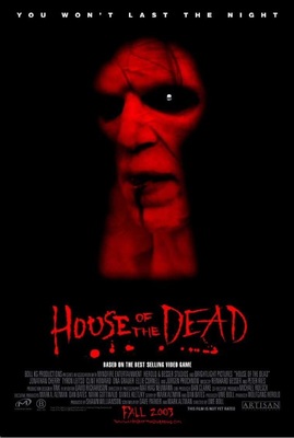
In stark contrast to the majority of the posters on this list, this poster seems to be lacking in both commercial and artistic merit, utilising a red opacity filter to hide fairly cheap looking make up effects and a blurry foreground keyhole shape the disguise the poor image composition. Which isn't to say the poster is entirely feckless, just that the majority of it is. Take for example the font of the main title, although interesting and visually distinct from the other captions. It is, although not wholly illegible, very horridly laid out which, granted, is in keeping with the film as a whole, and I'd wager only adds to the cheap look of this poster. If there was a cardinal sin however it would be the inclusion of a small white, generic skull png that looks as though it were pulled straight off shutter stock and pasted into the eye with no rhyme or reason. The inclusion of such an out of place yet corporately fickle feature sentences this design to poster hell where art work stapled together with stock assets in an attempt to appeal to a mass market go to die.
Movie: You're Next
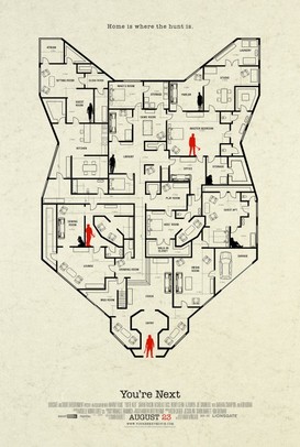
This poster above is a fantastic example of getting the tone, plot and style of your film across to audiences without a user of bombastic headlines and extensive blurbs. This independent film festival poster for 'Your Next' merges some of the most recognizable iconography from the movie (e.g The Animals) with a home schematic to convey the genre of a home-invasion slasher and couples with the motto 'home is where the hunt is' to reinforce the themes of family and security that arise in the moving picture. The soft off-white coloring isn't intrusive and leaves the real artistry to the line-work as subtle visual cues hint at elements of the film; for example, all of the victims are black, just like the house, implying that they are at home whilst the killers are done up in red which not only makes them stand out against the near monochromatic style but indicates that they are a foreign entity to this home. Red of course is infamously connotative of danger, blood and violence and as such, is an apt choice to portray the antagonists of our film. Studying the poster can also give clues as to what might happen in the movie such as the character in the right led on his side clutching being a nod to the wounded victim in the actual movie. Finally, it's interesting at least that the films title, although identifiable from the credits, is in a small, lowercase font whereas a lot of posters stick that front and center for brand development. The designers clearly had enough confidence in the short hand of the house and wolf mask that the generic title could be pushed aside in favor of this far more appealing aesthetic.
Movie: The Silence of the Lambs
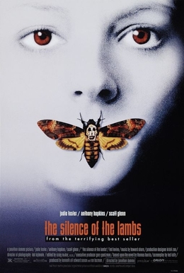
The 'The Silence of the Lambs' promotional poster is frightfully simple yet simply frightful. The expressionless woman of which the advertisement centres around conveys a feeling of void emotion and inhumanity, similar to that of the character 'Hannibal Lector', the starring antagonist in the film. Drawing a connection to its title, the poster depicts a rare butterfly intricately placed on her mouth which informs audiences of her 'silence'. Conspicuously standing out against the cold, monochromatic background, the bold, orange title attracts attention in a sophisticated font, however, all credits surrounding it feel as though they were neglected in the editing process as they are scarcely visible and find themselves compressed into the bottom eighth of the poster. Almost as if they were protruding, her blood-red eyes are easily-noticeable not only for the colour but for the sinister gaze they dart directly as consumers.
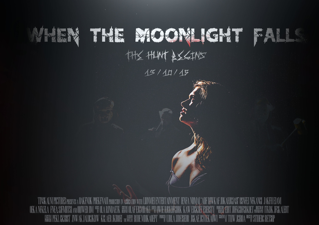
Our first practice poster