A production company is responsible for funding a movie and helps with the budgeting, scripting, scheduling, casting, distribution and marketing. Its also responsible for find a director, actors and to promote the movie. They have a very important role because without funding and publicity they wouldn't have a movie or a audience.
Hammer Productions
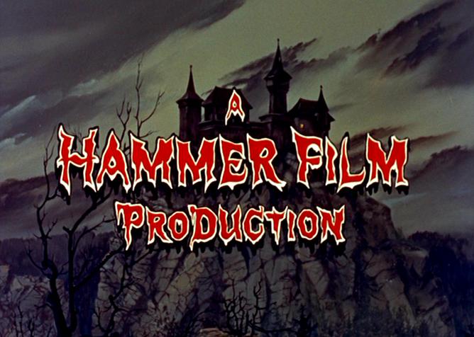
Hammer Film Productions is best known for a series of gothic 'Hammer Horror' films, but has also produced science-fiction, thrillers, film noir and comedies. It is a British company that was founded in 1934. Hammer Film Productions most famous films areThe Curse of Frankenstein (1957), which they continued to make six sequels. Dracula (1958), and eight sequels that followed after. The Mummy (1959) and the three sequels of the movie. The series 'Hammer House of Horror' was also produced by Hammer and was extremely popular. Recently, Hammer has produced Let Me In (2007), The Resident (2010) and The Woman In Black (2012). The production video is very similar to 'Marvel', having multiple images of monsters and killers in the letters of 'Hammer'.
Dark Castle Entertainment
Dark Castle Entertainment was formed in 1999. The name Dark Castle Entertainment pays homage to a horror filmmaker from the 1950-60's , William Castle. Some recent films they have are 'A Bullet To The Head' and 'Getaway' (2013). In Dark Castle Entertainment's logo video there are flashes of lightning and the camera wides from a close up of a gargoyle to a dark castle surrounded be clouds and backed by a yellow moon.
Blumhouse Productions
Blumhouse Productions are a horror-genre production company founded by Jason Blum. Since being established they've produced notable works such as Insidious, the Academy Award-nominated series Whiplash and the extremely successful franchise, Paranormal Activity. The latter is known for its individuality and generated a lot of profit as having only a $15,000 budget, amassed a gross of $193.4 million. Blumhouse is closely linked to and often works alongside Universal Pictures, the first combined effort coming in 2013 in the form of The Purge.
Twisted Pictures
Although simple, the 'Twisted Pictures' production company video is memorably distinct. At first we have the black-to-white gradient sans-serif font centred on screen and accompanied by a hideous lacerating steel sound effect which if revealed to be a particularly rusty thread of barbed wire. The rusted wire, although not as iconic as a ghost girl or a 'Twilight Zone' door, is still associated with security, being trapped, threat, disease and decay, seemingly appropriate thematic ideas considering that the company was set up for the original SAW film. From there, as if sentient, the wire takes on a snake-like motion, burrowing through and around the letters from either side until they meet at the middle where in a rail way rivet descends with some speed and winds the wire to a menacing tightness. Characteristically, the rivet is also coloured grimly, textured a metallic shade and jagged in almost every regard, serving to emphasise the hostility and threat of the picture. To wrap up we get a lightening flash, another, more child like memory of fear and the wire is gone, leaving the scratched text and the central, menacing rivet entwined in the remaining wire. This sting is short and simplistic, agreed, but the pallet fits that of its first and most notable film, SAW, with a deliberate grimy aesthetic you'd be hard pressed to disassociate from the snuff like influences the franchise has always drawn from for its representation.
Our Production Company
City of Fear Productions
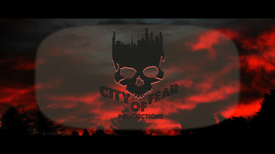
We settled on a self made production company called 'City of Fear' productions that combined elements from other horror as well as added some unique concepts to the typical design. Although the opening sting is short and only really shows of the red sky forest with a simple opacity pan on the central graphic, we feel that the design of the horror staple (the skull) mixed with the Los Angeles skyline is a respectful homage to the cinematic world of Hollywood whilst not become solely merged with the branding of other films. The Font style is also unique as it outlines the words in a bold san serif fashion with the words 'CITY' and 'FEAR' rising along side the skulls triangular teeth. Finally, we added the effect of a TV screen emboss to make it better stand out from the black and red pallet of the background and, again, as a knowing pastiche of the cinematic world. We believe that using our own self made distributor will be a smarter choice than using existing ones as they will be more creatively liberated whereas others that have been bought out as the mill houses of larger publishers are doomed to repeat very similar ideas time after time.
