|
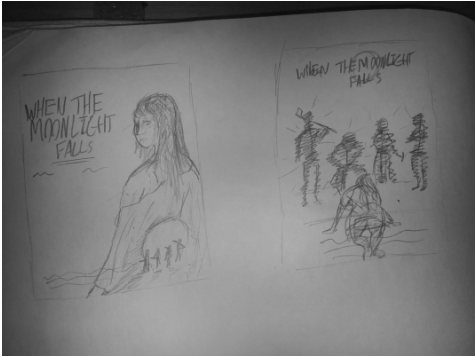
In order to better advertise WTMF, we designed to pull on popular elements from other existing horror titles and from recent trends in general to design a poster emblematic of the tone, style and experience of our film. Although the final version didn't stray far from the original concepts, the idea of positioning our lead character (Gabriella Marriott) as the central subject in a sexually suggestive outfit whilst the killers and the moon were visible has seen many incarnations with early drafts (seen below) having a white background rather than a black one to better highlight the killers and scene within her silhouette. Although our final poster does noticably include assets taking from the internet (such as the skyline or the fog), these have been transformed into a new product and as such fall under the fair use guidelines and, given the greater context, is the equivalent of advertisment companies buying stock images to break apart for their own work.
|
|
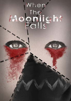
At the same time, in the spirit of old fashioned posters, we didn't want to reveal the killers directly, merely make allusion to them as popularised by the scene within the outline style of the original Friday The 13th poster or Michael Meyer's knife hand along side the pumpkin of Halloween's 1978 offering. There were even concepts that took their figures with heavy lighting cues surrounding Gabriella and a picture of her face ripped and torn to reveal bits of the mask, however after an early Photoshop mock up using existing but modified internet assets this concept was scrapped as looking a little to corny and not focusing on the horror element of the film.
|
|
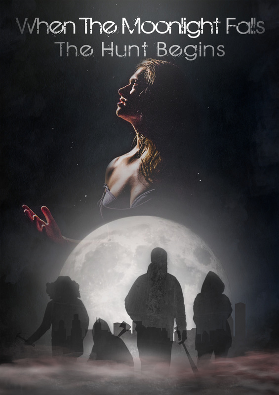
The final design we came to settle on depicted our lead standing in a beam of moonlight projected upwards from the moon as the killers walked in the foreground; with this settled, production began on a first poster utilising photos we'd taken from a previous shoot, depicting Gabby under a spotlight looking upwards with the majority of her bust and face illuminated but hands bloody. The killers were then etched into the background at a lower opacity before fonts were thrown on top with title cards as well. However, we felt that the minimalist aesthetic we'd settled on wasn't being met - ironically because of a lack of content - and decided to redraft this design with the moon of the title actually in the shot.
This new, portrait edition was more or less completed with only minor tweaks required for the final edition. Since the last cut, the poster had received a strong use of very dark blues and the centres and sides to emphasise the night life theme as well as to give the dark a much richer and textured design. We also added in a city scape behind the killers who's new photos were closer to the one's depicted in our trailer as opposed to the 'You're Next' homage they'd began as, the main reason being that we wanted to emphasise how the project dealt with modern, prevalent ideas with the decadent city scape a shining example of capitalist imagery. Finally for the additions, we added a mist effect to the lower section tainted by blood to provide connotations of both mystery and danger as well as putting white dots in the air to mimic the detail found in floodlights from dust fall. However, there were still a few things we couldn't agree on, most whimsically being that upon further viewing, the pose of Gabriella looked "too much like a musical" and as such we sourced another violent but voyeristic image with a personal gripe of my own being the city appearing through the killer silhouettes which was finished in our final cut.
|
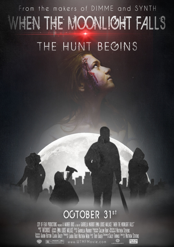
This is the final version of our poster, as you can hopefully see this has developed from a very simple sketch all the way into a final piece complete with titles and corrections. This poster we feel embodies the values of the films nicely as well as adhering to set traditions in existing horror circles, the icon of the scantly clad female protagonist revels in the retro whilst the stacked up scenes of visual splendour but geographic inaccuracy is a timeless style still frequent to the billboards and bus sides of today. Not only that but the allusion of the killers without a direct reveal baits the audience without directly disclosing what is going in, drawing them to question what the film might be about, from a graphology standpoint, this would be why the social media icons also sit below them as the pan down of your eyes from poster top to bottom naturally encourages you to go on and engage with the advertising.
|
|
Final Page