PART I: Branding
When branding your product it is imperative that you gift your brand an icon. Iconic images are nearly always the initial factor that you imagine when you think of certain brands; for example:
|
Halloween
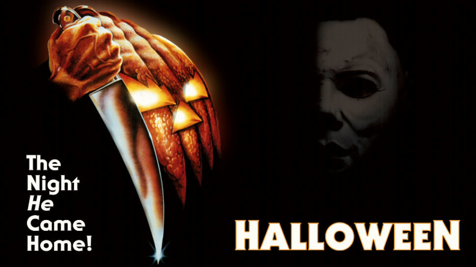
John Carpenter's 'Halloween' - released in 1978 - can be recognised instantly purely though the image of the hand holding a knife next to a pumpkin. The fact that nearly forty years have surpassed and Iconography is still relevant in horror culture shows how vital icons are in film. Halloween's trademark image isn't exactly complex, it has just taken a weapon and something associated with the holiday itself and that has transformed into something we always associate with this classic. |
|
|
The Silence of the Lambs
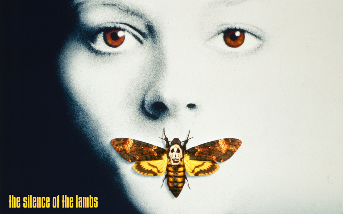
Jonathan Demme's 'The Silence of the Lambs' - released in 1991- features a picture of a woman with a moth over her lips; this image is specific to its brand as it is instantly recognisable as an icon from the film. To achieve this image, the idea was taken from the mark that the movie's killer Buffalo Bill leaves his victims with - a moth. Again, it's nothing extravagant, it's easy simple and easy enough for even a casual audience to remember. |
|
The Exorcist
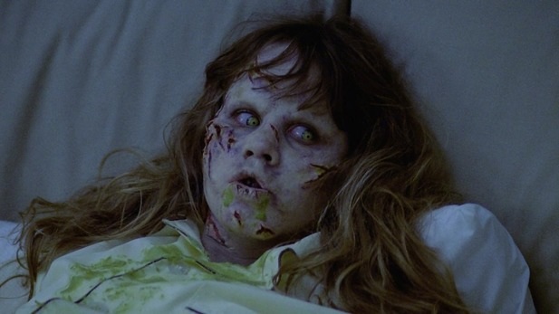
The Exorcist, released in 1973 uses the girl - who happens to be the victim - as its icon. This movie became the first screenplay to be nominated for an Academy Award for 'Best Picture' due to its ground-breaking subject and context. Nowadays the face of the little girl is known all around the world as the girl from the exorcist. We've taken inspiration from this, using a female victim as our icon. |
|
|
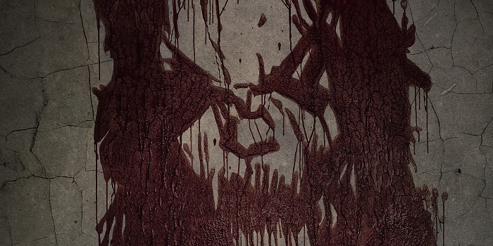
Sinister
In terms of modern-day horror, Sinister is an example of using iconography in order to promote the film and gain brand awareness. The distorted face painted in blood on a dirty, cracked wall has become the mast of their brand and is an example of how contemporary symbols still play a huge part in the trademarking of horror films to this day. |
As you can see, there is some incredibly iconic imagery scattered through the horror lineage for films both avoided and drawn upon by WTMF; the spinning and blood curdled face of The Exorcist's girl is so synonymous with the film that it has reached a point of parody. For our Trailer, we tried to focus on collecting together a collection of immediately identifiable assets that, when referenced, would relate back to our marketing campaign which is a trickier job than it might initially seem as creating imagery that can be burned into the public conscious (especially nowadays where it must battle with such an onslaught of media) and as such required a heavily curated set of principles.
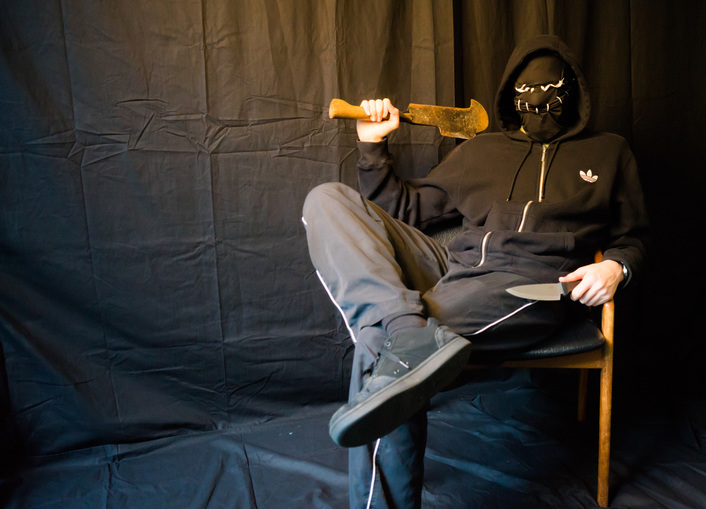
The Killers: One of the most noticeable things about the killers is how they look, their masks specifically designed to stand out against their predominantly black outfits thanks to the white threading. Masks are not a new thing in horror, in fact the process of 'masking' is a recognized psychological trait used to hide the inner workings of a person so that they might better fit into a societal frame work hence why the lack of or change in identity allows people to mentally justify what they have done. Jason had his hockey mask, Leather face had his...well his leather face and we've got our Scarecrow, Missy, Grim and The Leader/Speaker. The hope was that by giving an audience these four distinctive personalities we'd invited an air of mystery and intrigue, villains are often the most intriguing character in a work so to have four of them all very much human in their movements and actions yet hidden beneath the facade of a face invites the audience to wonder who they are and what exactly they want. What is their motive? How did they end up like this? All questions teased in the trailer itself and shown off explicitly at points to build upon the allure of their identity and create a circulating interrogative in the public perception: "Who are these killers and what are they doing 'when the moonlight falls"
The Killers: One of the most noticeable things about the killers is how they look, their masks specifically designed to stand out against their predominantly black outfits thanks to the white threading. Masks are not a new thing in horror, in fact the process of 'masking' is a recognized psychological trait used to hide the inner workings of a person so that they might better fit into a societal frame work hence why the lack of or change in identity allows people to mentally justify what they have done. Jason had his hockey mask, Leather face had his...well his leather face and we've got our Scarecrow, Missy, Grim and The Leader/Speaker. The hope was that by giving an audience these four distinctive personalities we'd invited an air of mystery and intrigue, villains are often the most intriguing character in a work so to have four of them all very much human in their movements and actions yet hidden beneath the facade of a face invites the audience to wonder who they are and what exactly they want. What is their motive? How did they end up like this? All questions teased in the trailer itself and shown off explicitly at points to build upon the allure of their identity and create a circulating interrogative in the public perception: "Who are these killers and what are they doing 'when the moonlight falls"
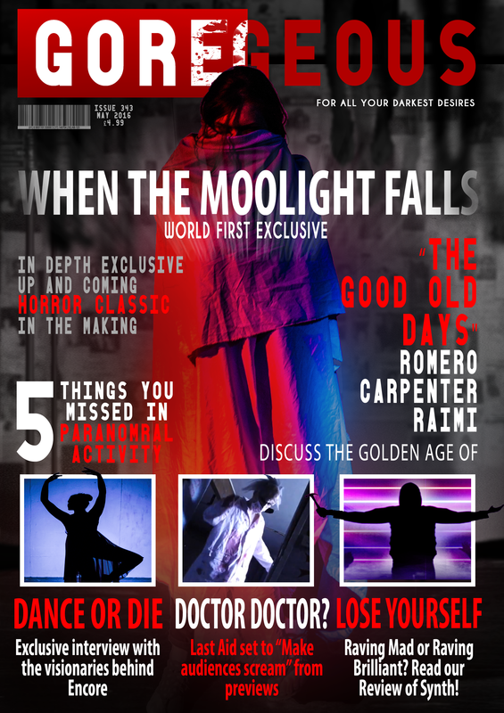
The Victim, Marked: We knew from early on that Gabriella would be a leading lady for her innocent yet beautiful looks, a kind fragility in her face that might trigger a protective instinct whilst an aesthetic maturity that would trigger other instincts, suffice as to say that she very nicely fit into the horror movie heroine mold yet at the same time, with few exceptions, it's incredibly hard to name the countless throw away movie protagonists that end up on the cutting room floor quite literally thanks to poor branding despite star power being a huge part of a modern movie's marketing effort. Instead, we decided that the girl could not appear 'perfect', she had to be maimed and marked specifically with different interpretations of this iconography coming and going. The ideas that stayed were the wound to the face (seen in the poster as a deep gash and in the trailer as her missing eye) and a sadistic set of cut lines on her face as though she were a piece of meat for a butcher. One of the very first shots in the trailer with Gabriella in it shows this marked up face and emphasizes a feeling of objectification more than horror movies usually do, although it is common for the heroine to take a bit of a beating, to be so physically disfigured and methodically marked pushed this trope beyond the pale and is something now hand in hand with 'When The Moonlight Falls'. Her hospital gown, missing eye and marked face make their way into almost every piece of promotional content including the magazine as seen below due to how strong a visual it is. The butterfly on Jodie Fosters lips or the demonic makeup of the girl from the exorcist are haunting at times and, if flashed up at a pub quiz, easily recognized so the hope is that by continuing this theme of disfigurement to the innocence, we will make a very strong connection in the viewers brain to our intellectual property.
The Camera and the Light: The title makes reference to the moonlight quite explicitly and as such is something we pushed hard to be emblematic of our trailer. However, something as obvious as the moon is a fools idea of re branding so instead we focused more on the extreme lighting of the imagery, experimenting with traditionally white only beams before branching into a whole suite of cinematic styles that give WTMF an identity of its own on the market. Strong primary's like shots with only red light or that balance extremes like blue and orange create a stage of incredibly stark images which is also why we lent away from using an overabundance of narration in our trailer as it detracts from the spectacle of our work. The moonlight is a routinely referenced piece of imagery through both our main and ancillary texts but simultaneously, we didn't want to wear thin an already quite tired staple of cinematic shorthand hence why we pushed Gabriella's victim and the killers more.
It is our belief that all three of our products (the trailer, the poster and the magazine) stress one of these points explicitly whilst referencing the other pieces of branding subtly, meaning that the imagery never becomes so common place as to be boring whilst also creating a whole net of brand associative symbols in the cross pollination of the different mediums. Where Gabriella as the damaged victim are center stage in the magazine, it is nodded towards in both the trailer whilst that takes time out of its own agenda to focus on the garish cinematic pieces and also in the poster which has a bigger push on the illusive identities of the killers (which is why they are silhouettes). Hopefully this will highlight to you how these pieces of branding meld together to form one cohesive new property for the masses that incites fear and invites discussion.
PART II: Our Product
Magazine Cover
Initial versions of the Magazine Cover aimed for a late 90's horror vibe and were drafted up relatively independent of the majority of the planning work, hence why it goes against a lot of the points I have been making. Putting aside the the swath of possible complaints in regard to the layout, the general idea we liked enough to effectively modernize (as seen below) although we felt that the pictures of the characters in the animal masks (which were taken in the early days of production as a test concept of sorts) were too conflicting with the branding we'd built up with the new killer identities and as such, we moved towards a design that put the emphasis on our marked victim concept and the visual style of the trailer with it's bombastic colors.
Original Magazine Design
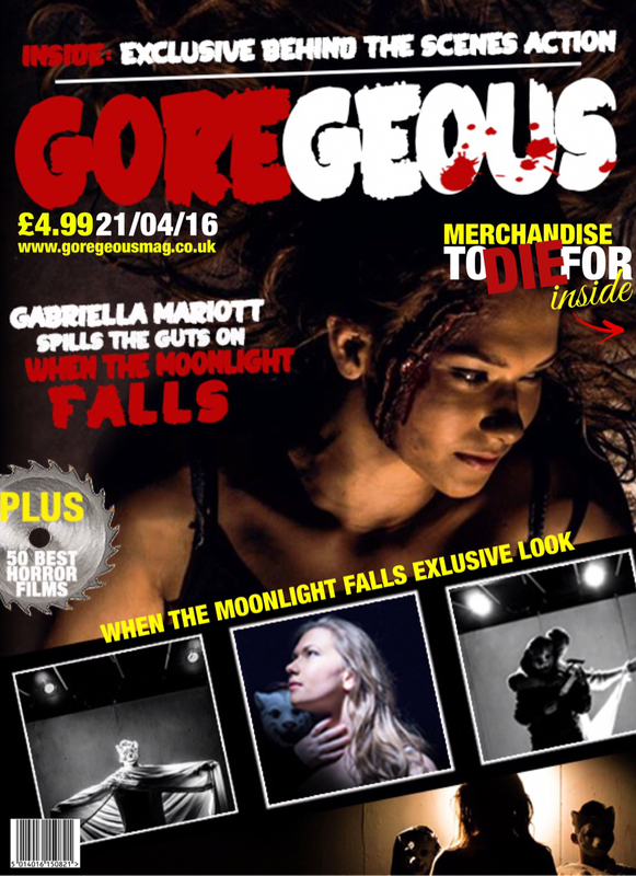
New Magazine Design