The way in which a film presents it's main title (or masthead) can tell you a lot about the tone, content and nature of the movie itself; a somber exploration of the inner workings of Humanity's moral compass is hardly going to shout garish and obnoxious font choices at it's audience after all. Horror films are especially subject to this as the standard Gothic/Old Style typeface so common to the genre is forgettable at best and lazy at worst and as such, we wanted to make the title for 'When The Moonlight Falls' eye catching and thematic whilst establishing a very clear brand.
|
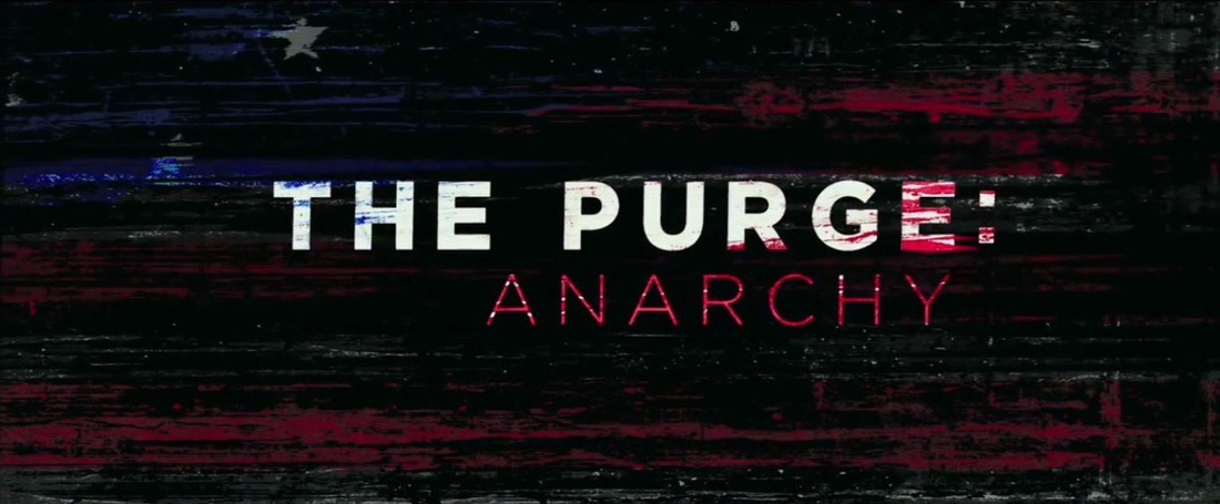
One of the more interesting designs in recent memory - not just for the titles but as an overall aesthetic - has been the merger of sudo-patriotic imagery with the horror style in The Purge. We get the modern block white san serif text as standard with just enough tracking between letters to make each one really stand out whereas the subtitle is in a much sleeker, almost business like lettering. The main point however is how the blood and/or paint of the American Flag has colored the titles with a stain which connotes the titular 'anarchy' through its inconsistent patterning. Interestingly, by associating it with a version of the flag that is red, black and blue rather than white, you contradict the expectation and through this dissonance of iconography, invite your viewer to see what you are presenting as off-kilter and in need of examination.
|
|
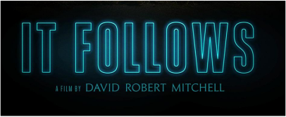
IT FOLLOWS was a very specifically toned movie to say the least and the title does all it can to instill this idea in the viewer from the outset. The most immediate element of the title is the glowing, neon sign styling it's adopted which foreshadows the sleazy night life that gets the lead into her predicament in the first place. As a bit of a theme we see the return of the san serif style online this time as an outline rather than as a solid block; this wiring is also cyan blue which is associated with the night and quite ironically, responsibility - the opposite of the protagonists voyeuristic actions.
|

|
Finally there is the SCREAM font which is one of the most iconic out there despite it being fairly simple. We see the return of tried and tested block sans serif (this time in mysterious black) with some tight tracking to keep the letters claustrophobic. The only real deviation from the norm is seen in the M which sharpens the trough into an extruding under hanger. Of course, you could argue that sharp pointed things represent a lot of things such as an abyss, a search light or even a phallus if you're being Freudian. However, the obvious one is the point of a weapon like a knife or spear and as such it a typographic representation of the danger withing the film.
|
