Reactions
Before we questioned people further we wanted to see what people would instantly think and feel about our trailer. So we decided to set up a scare booth and film peoples reactions while they watched the trailer for 'When the Moonlight Falls.'
Social media
Social media is a great tool for the film industries to use, both to advertise their coming films and to gain feedback from audiences about there products. Therefore to gain feedback on our trailer we decided to use the same principle by uploading our trailer to my Facebook page and asking people to leave comments about what they like and did not like. Facebook was also a great place to get feedback because the people likely to see and react to my post are part of our market audience, around the age of 15-25, so we could get a really accurate account of what our target audience will think of our product.
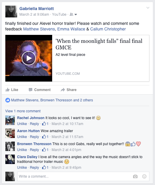
Overall People seemed interested in going to watch our trailer as we got lots of positive feedback. Clara Dailey commented that 'I love all the camera angles and the way the music doesn't stick to traditional horror trailer music.' This shows us that our use of techno music in our trailer was appreciated by our target audience, this was great feedback for us as although we felt this type of music was the most fitting for our trailer, which is based around the online black market, we were unsure how audiences would respond as it is not a conventional music for a horror. Clara also stated that she loved our camera angles this was great as we really tried hard to use a variety of different camera angles and shots in our trailer.
Survey results
Here are some of the results from our survey.
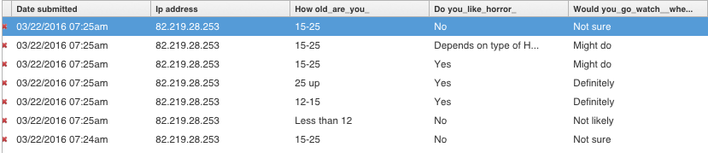
From these results we can tell that the majority of our target audience is 15-25 and will be likely to watch are trailer with the majority of people saying might do or will definitely will.
Poster Evaluation
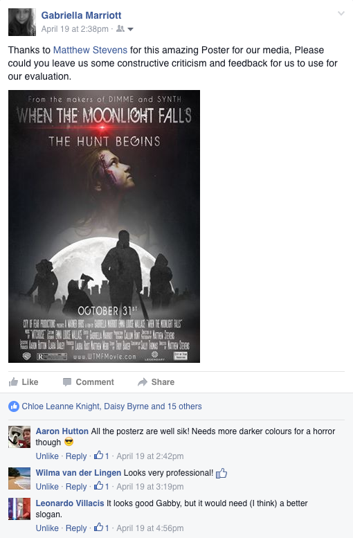
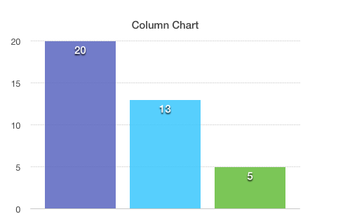
From our feedback we can see that overall people liked our poster but that they felt it needed darker colours and more gore to make it more obviously a horror trailer. As well as this Leonardo Villacis said "it would need (i think) a better slogan."
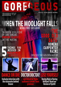
Magazine Cover Evaluation
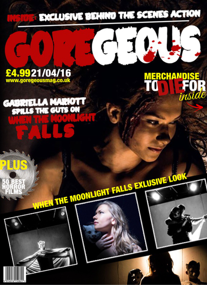
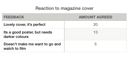
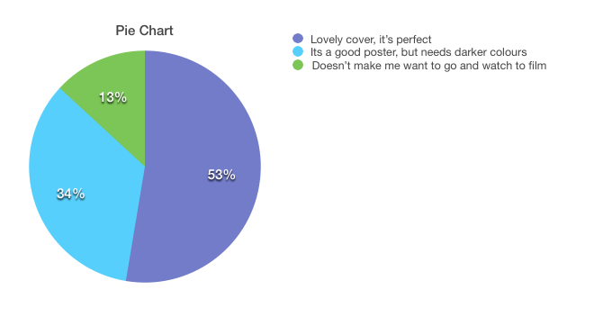
For our feedback we can see that the majority of people - around 53% - feel our poster is perfect the way it is, with people telling us things like 'Great composition' 'i like the darkness of the colours' and 'Lovely title!' . On the other 34% of people we asked felt that our magazine cover could use a couple of improvements for example using darker colours and 13% of people didn't like our poster at all. This is useful for future reference if we were to redo our magazine cover we could use darker colours and more gore so that it would appeal to a larger audience.
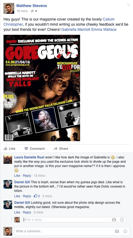
After completing some audience feedback on our magazine, we decided to respond with a more relevant and modern set of sensibilities such as the layered font and image choice as well as a turn to san serif text that is more in keeping with design trends set by Empire. This new design emphasised a much cleaner layout that wasn't as 'trash' looking thanks to having one piece of core iconography to the film and several redesigned insights into 'When the Moonlight Falls' itself.